Children's Safe Harbor
A Sense of Place: Capital Campaign Brochure
Children’s Safe Harbor serves multiple counties north of Houston, providing one centralized location where sexually abused children and their families can meet with, and receive support from, a Multidisciplinary Team made up of Forensic Interviewers, Family Advocates, and representatives from law enforcement, Homeland Security, the Department of Family and Protective Services and local prosecutors.
In the past, child victims of sexual abuse and trauma had to seek help through multiple contacts with different community professionals and law enforcement agencies. This created a maze of confusion and distress for the child and family. Children’s Safe Harbor changed all of that.
This brochure was the centerpiece of a campaign introducing Children’s Safe Harbor to potential corporate donors and high net-worth individuals as the next step in phase one funding for a new facility. This facility was critical in addressing the needs of child victims, families and law enforcement that have seen an astounding 6700% increase in forensic interviews alone since 1998.
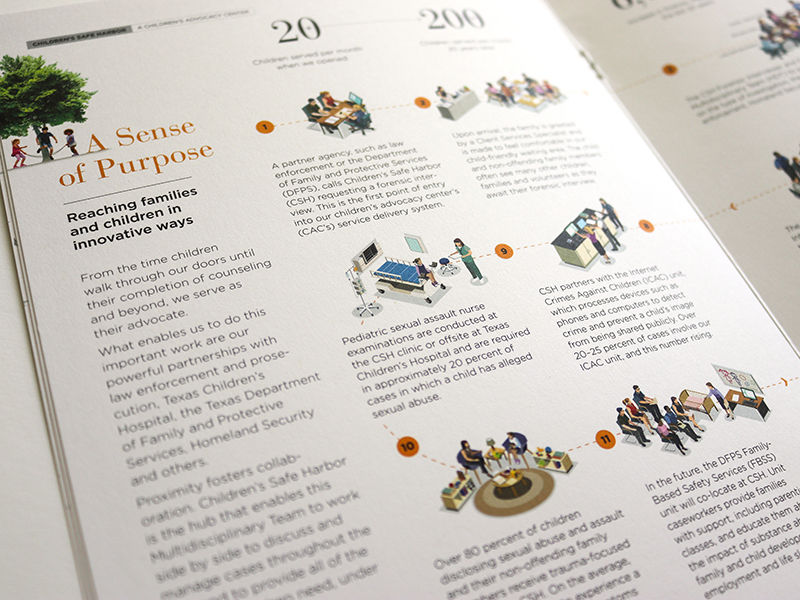
“A Sense of Place” was used as the concept for this brochure, referring to both the safe emotional place a child needs for healing after their world has been turned upside down by sexual abuse, and the physical facility CSH was intending to build on an expansive, quiet, wooded site north of town. The brochure was designed to be succinct and minimal in copy, bright and airy, and open and positive – in stark contrast to the darkness these children have experienced. Illustration was important for three reasons – to create warmth and a human feel, protect the identity of the children served, and illustrate the process realistically.
Client /
Children's Safe Harbor
Role /
Design Director: Visual concept, design and production
Agency /
Savage Brands
Illustration /
Jack Slattery


